Christine built a strong personal training practice in Bracebridge over 12 years before opening Flow Pilates + Social in 2024. She needed a brand identity that felt refined and professional without leaning on expected wellness studio tropes.
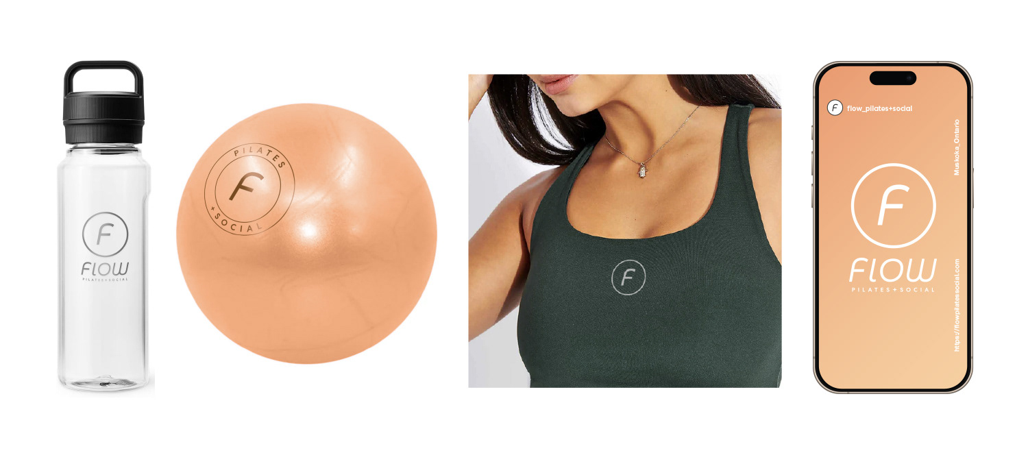
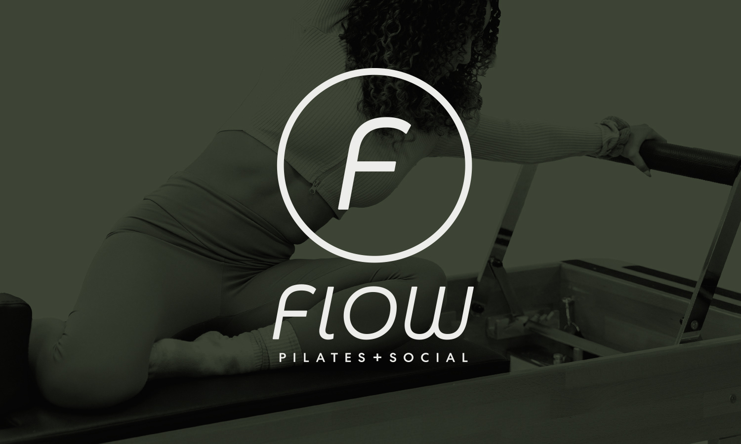
Working through a structured discovery process, I developed a typographic wordmark with open counter-spaces and curved letterforms that subtly echo breath and movement. The identity system includes vertical and horizontal lockups, an icon, and an emblem for flexibility across print, digital, signage, and merchandise.
Flow Pilates opened to a full class schedule and continues to grow its presence in the Muskoka market.
“Mike took me through the branding process of my Pilates Studio like a true professional. He has in-depth knowledge of design and he intensely studied the fitness market, which was exactly what I needed. He delivered an impressive product; one that draws so much attention in my small town.” ~Christine, Founder, Flow Pilates + Social