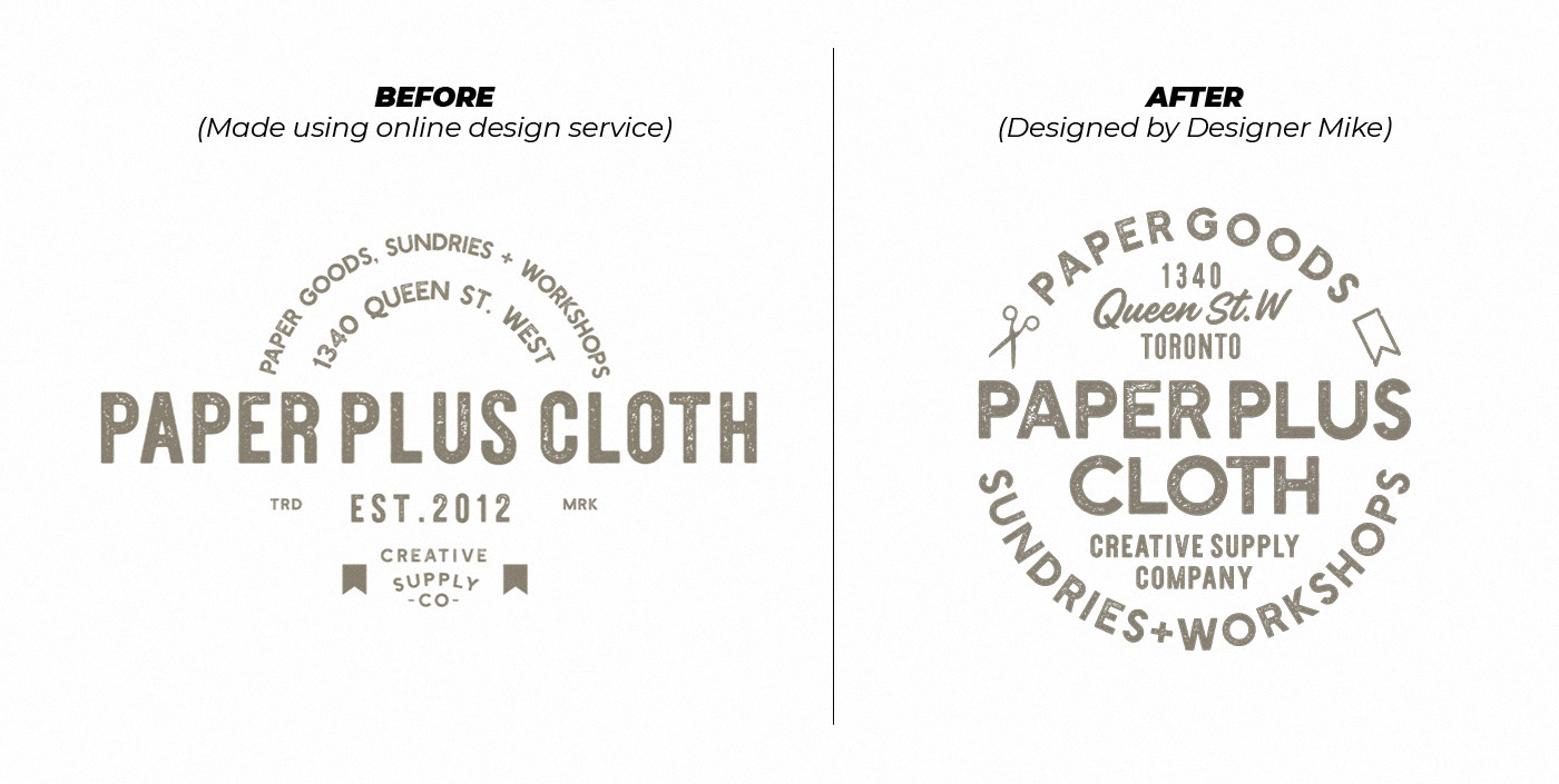
Paper Plus Cloth had outgrown its original template-based logo. The challenge was to retain the handmade warmth loyal customers recognized while delivering a mark that could scale cleanly across packaging, digital platforms, and shipping materials.
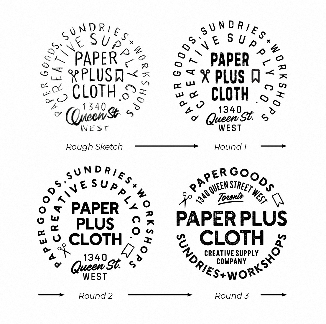
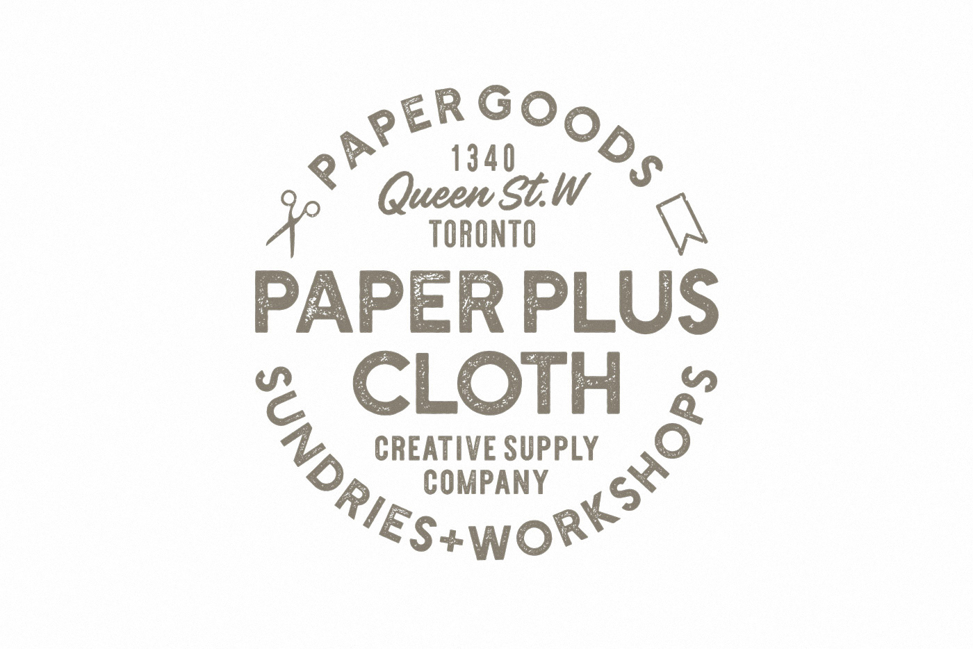
I refined the typography for legibility at small sizes, introduced a simple scissors and ribbon icon to reflect the tactile nature of the brand, and built a clean lockup using the brand's existing typefaces.
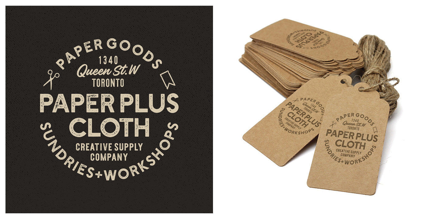
The refreshed identity has been in continuous use for nearly a decade and appears across the brand's packaging, shipping materials, and web presence.