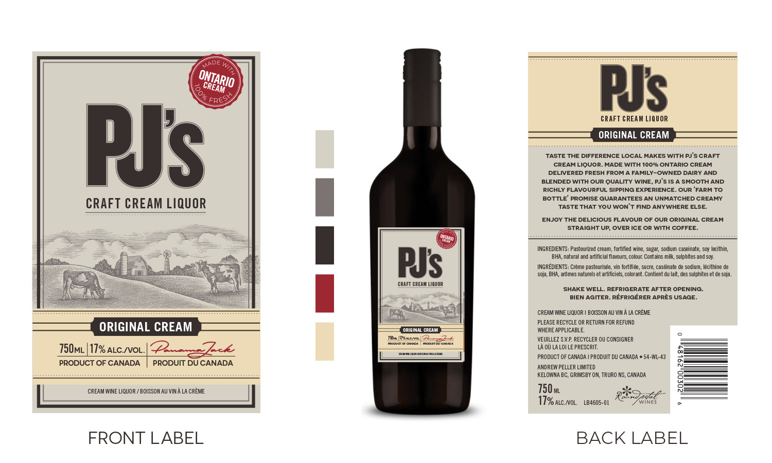
PJ’s had strong local recognition but weak shelf presence. The original label felt generic and didn't convey the craft or regional authenticity behind the product. With no option to change the bottle or add premium materials, all improvement had to come through design alone.
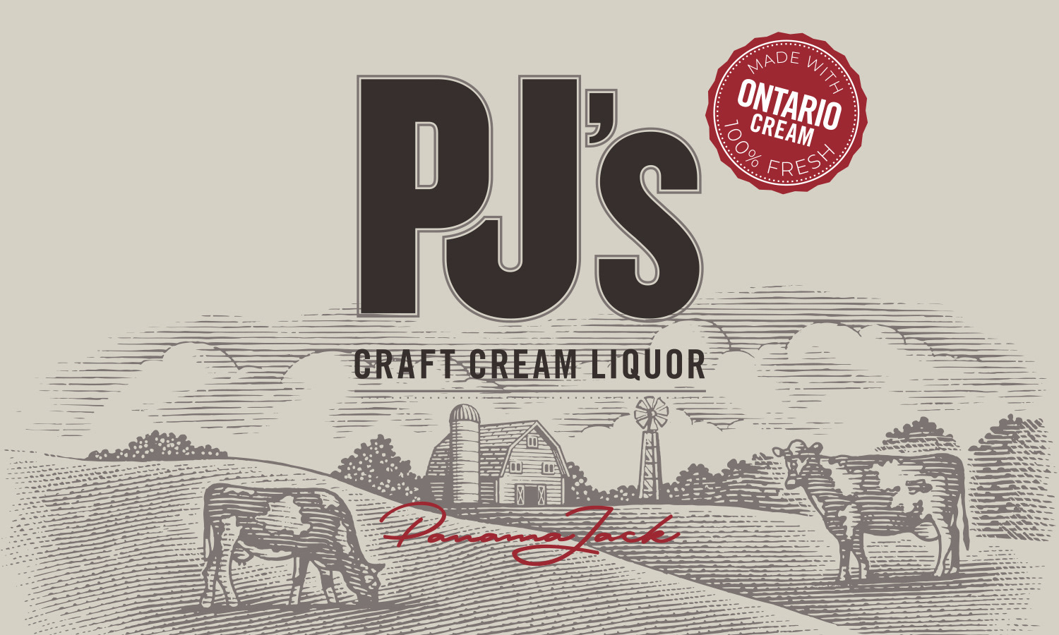
Working with A Smaller Agency, I led the label redesign from concept through final production art. Introduced refined typographic hierarchy, richer colour contrast, and subtle craft cues to signal quality. Directed the selection and licensing of a woodcut-style illustration by renowned illustrator Steven Noble to add tactile texture and a sense of heritage. Reframed the Ontario Cream message as a proud trust mark rather than an afterthought. Maintained familiar visual anchors so the brand remained easy to find on shelf.
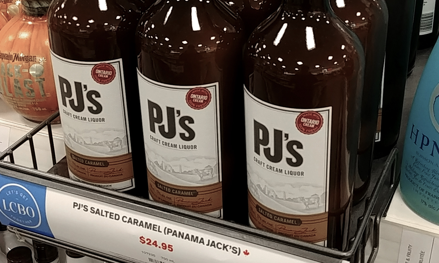
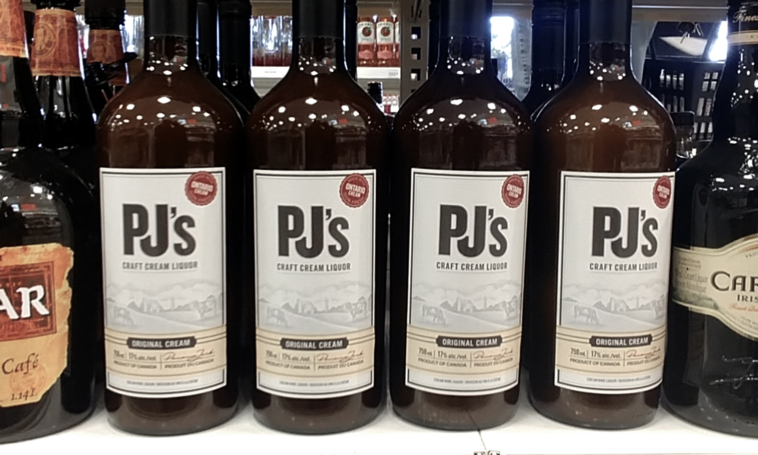
Eight years later, the same label remains in market. The line has expanded, earned a Double Gold Medal at the 2018 Finger Lakes International Wine Competition, and continues to hold LCBO placement.