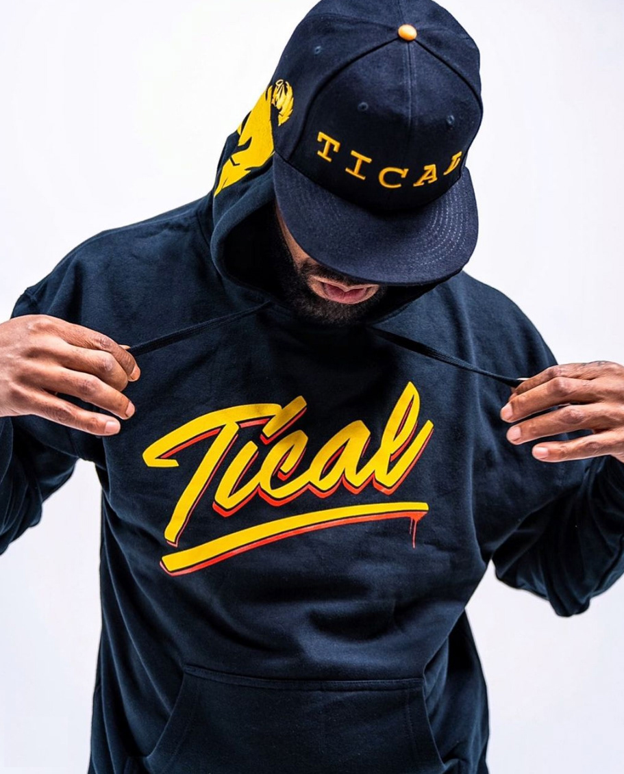
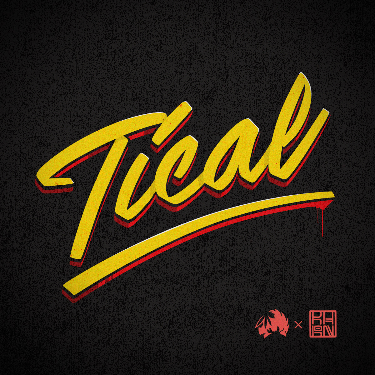
This project didn’t start with a brief, it started with a love for the culture.
As a lifelong hip hop fan with Wu-Tang Clan’s 36 Chambers in heavy rotation, I created a lettering piece inspired by Method Man, whose raw style, signature voice, and charisma had always stood out to me. The goal was simple, channel the energy of his music into a handstyle that felt gritty, rhythmic, and unmistakably street, but still keeping my signature bold, clean style.

The design wasn’t made for a client, it was made from the heart.
Lettering Style: I leaned into expressive strokes, angular rhythm, and subtle imperfections to echo Method Man’s lyrical cadence and underground roots.
Tone: The piece struck a balance between raw energy and visual clarity, designed to catch the eye.
Authenticity: Every line was drawn with the reverence of a fan who grew up on this sound with no filters, no polish, just honest craft.

After I posted the piece to Instagram, Tical’s team reached out for a licensing deal. They felt the energy. They saw the connection. It became part of the brand’s official merch launch.
In October 2020, the design was released as part of a limited-edition drop in the Tical Official online store. It became one of the defining visuals of the campaign bridging Method Man’s legacy with the modern cannabis lifestyle space.
What started as a personal tribute became a licensed piece of official Wu-Tang history. Cuz Meth-tical got styles, all of them sick.
Back to Top