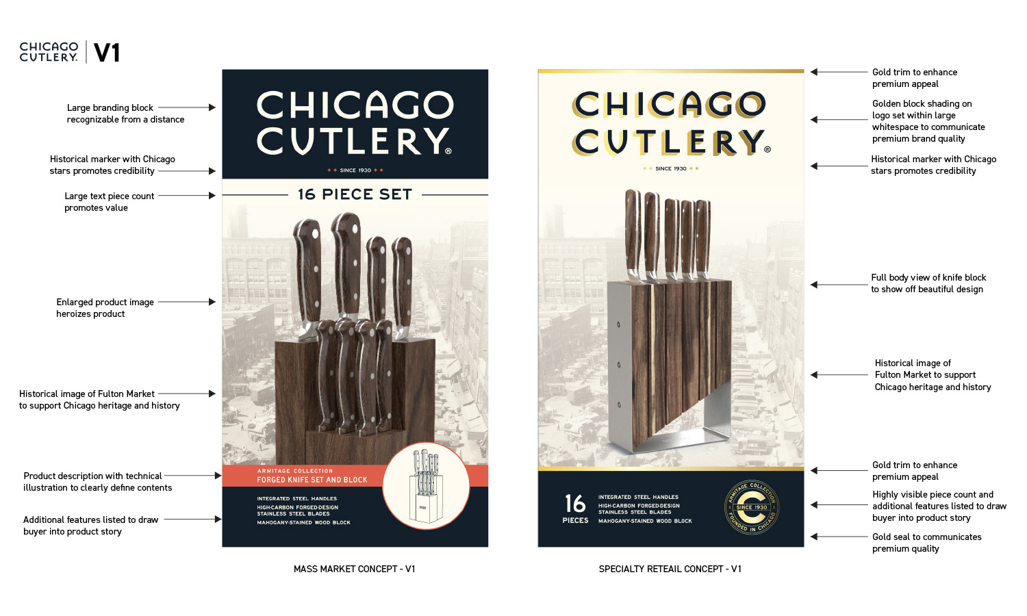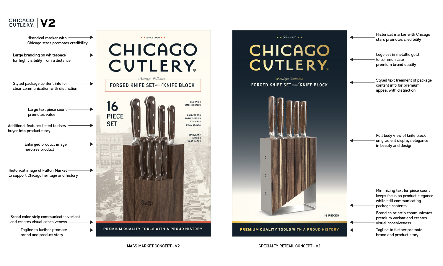
Chicago Cutlery needed to move from suburban anonymity into a brand with character and personality. The restage targeted two distinct retail environments, mass market and premium specialty stores, requiring different visual approaches while maintaining a cohesive brand identity across trilingual packaging.
Working from existing brand guidelines and historical design references, I developed the art direction and design across two packaging tiers and extended the brand expression across every consumer touchpoint.
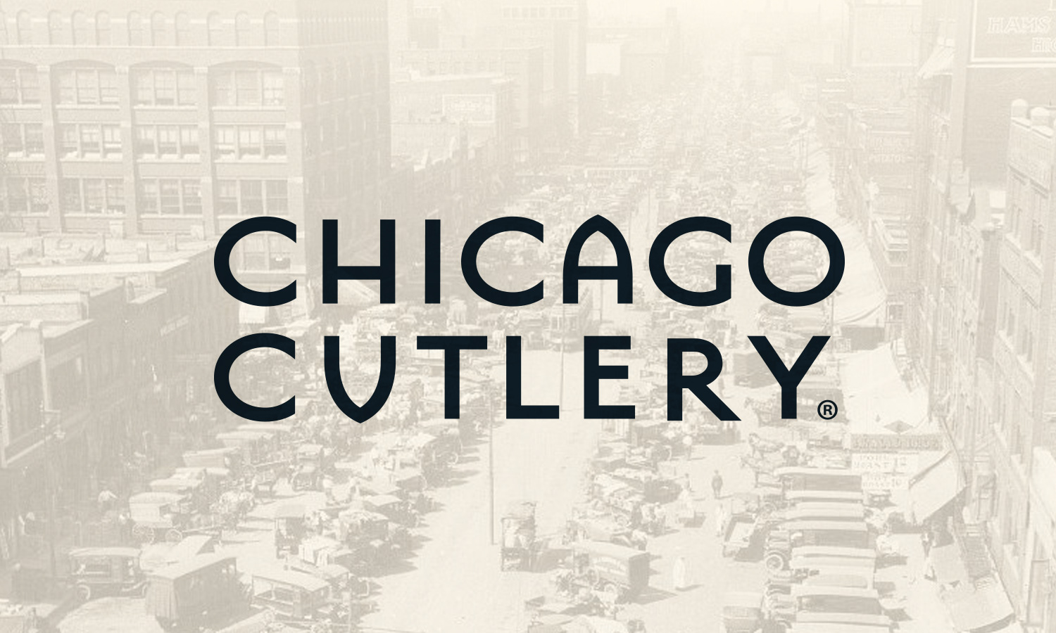
For mass retail, a bold branding block for shelf visibility, heritage imagery anchoring the brand’s Chicago roots, and clear feature callouts communicating value at a glance. For premium specialty, metallic finishes, restrained typography, and full-body product imagery to signal craftsmanship and invite closer engagement.
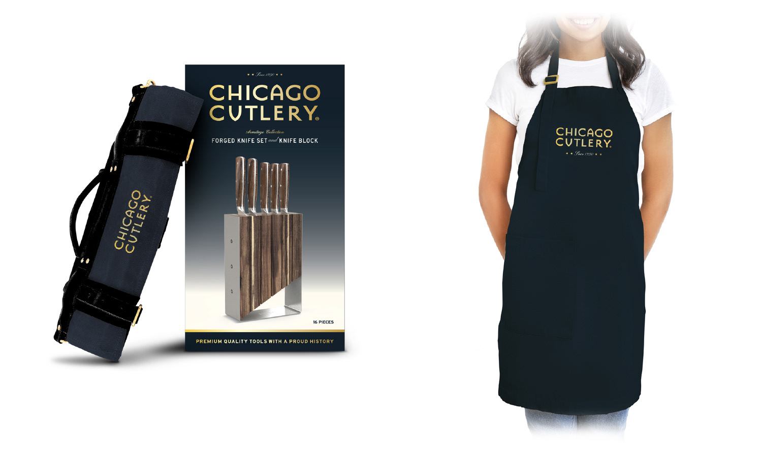
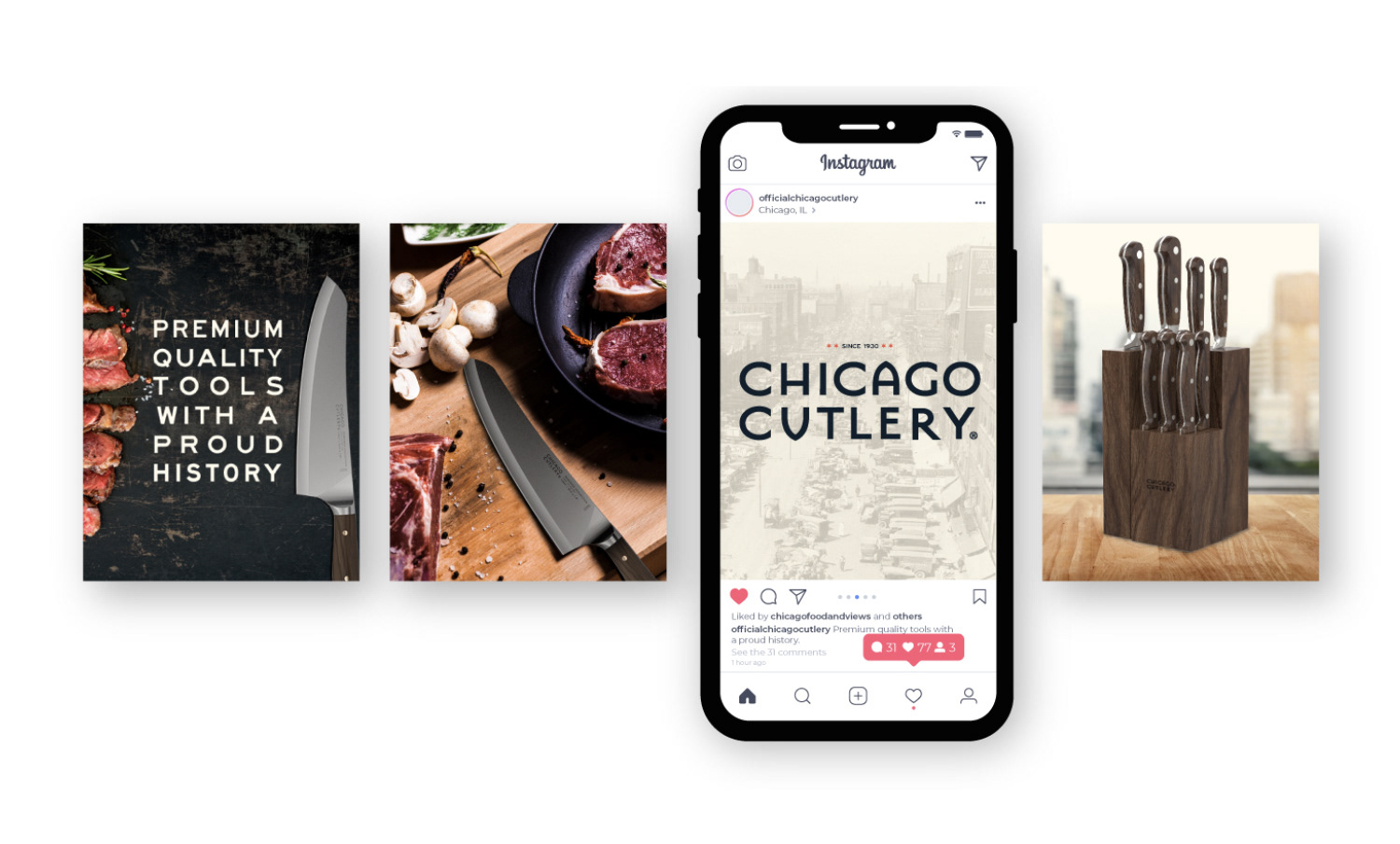
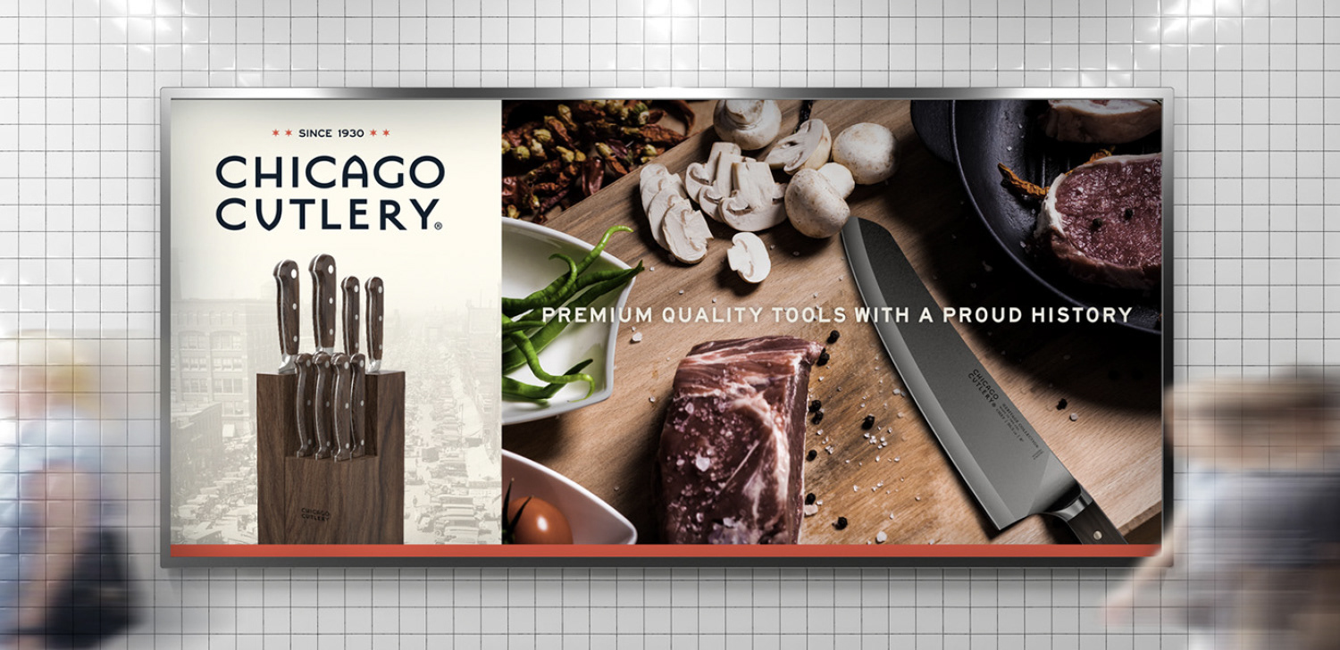
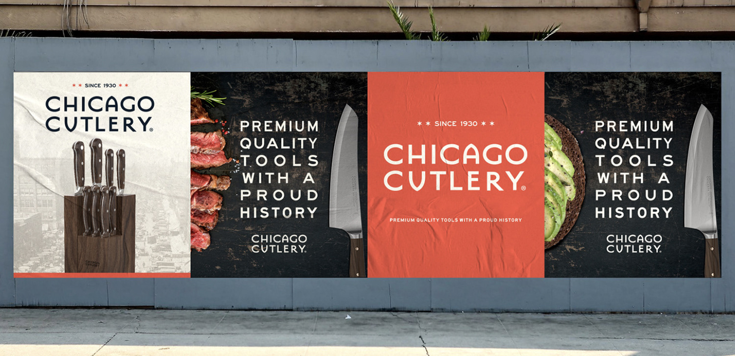
The work extended beyond packaging into a complete brand expression system including premium branded accessories, subway advertising, wild postings, and a social media content series, each designed to reflect and reinforce the packaging identity for on-shelf recognizability.